How can you interpret your Kano results?
| | Director Business Unit E-Invoicing/SAP&Web Process, SEEBURGER

Kano series part 3 – Analysing and interpreting your results.
Kano questionaires can give you valuable insights into what customers think about a certain characteristic in a product or service. Analysing and interpreting these results intelligently is key to giving you results which you can translate into meaningful measures. Read on to find out how to crunch the data in your Kano questionaires to get meaningful, useful results.
The terminology used in the Kano model is explained in part 1 of this Kano series. Read part two to find out how to use the Kano model. This part of the Kano series looks in detail how to analyse and evaluate the results from a Kano questionaire.
The Kano model gives you good pointers in how to further develop your products by classifying the various characteristics of a product or service as one of five attributes. We have covered this in some detail in the first part of our Kano blog series. These attributes enable you to
- better understand customer expectations and identify those features and functions which have the greatest impact on customer satisfaction.
- prioritise product features by the benefit derived from the customer and
- identify and develop excitement attributes to make your offering stand out from the competition.
The Kano model: categorising features and functions
As described in our blog post on how to use the Kano model , a Kano questionaire contains a pair of questions for each feature or function, each with five possible responses (figure 1). The first question in the pair always gauges the customer’s reaction to a characteristic being present (known as a functional question) while its pair assumes the characteristic is absent (known as a dysfunctional question). There are five possible responses to each question, on a scale:
- I like it
- I expect it
- I am neutral
- I can tolerate it /I can live with it
- I dislike it

Using the Kano evaluation chart below, the responses to both the functional and dysfunctional question place the characteristic into a category:

Figure 2: The Kano evaluation chart, translating responses to categories[1]
By looking at the frequency at which a feature has been placed in a particular category (basically, the mode customer response), it’s possible to see whether it’s considered a threshold, performance or excitement attribute by your target market segment. In figure 3, you can how often 200 respondents placed ʽfeature 1ʼ into a category The mode category, at 35 %, was excitement attribute.

How to interpret a frequency distribution
In practice, you may be find that responses are spread rather evenly among the five attribute categories (such as for feature 2 in figure 4)

In order to more closely evaluate the frequency distribution, you may draw on the additional criteria of ʽcategory strengthʼ and ʽtotal strengthʼ. Category strength shows how distinct a category is compared to the others. The category strength should be higher than 5% to show that a feature unequivocally belongs in that section.
Category strength = percentage of most frequent response– percentage of 2nd most frequent response
The total strength shows to what extent respondents consider a feature to be important. As a rule, the value should be over 50%.
Total strength = percentage A + percentage O + percentage M
In example 2 (see figure 4) , feature 1 has
- A category strength of 35 % – 25 % = 10 % and
- A total strength of 35 % + 15 % +25 % = 75 %.
Therefore, feature 1 is clearly an excitement attribute. In contrast, feature 2 has
- A category strength of 19 % – 19 % = 0 %
(a tie – the difference is not higher than 5 %) and - A total strength of 18,5 % + 19 % +14,5 % = 52 %.
The category strength shows that there is no clear category for feature 2, and this needs further analysis. The total strength of 52%, however, clearly shows that repondents view this feature as positive. The next step is therefore to clarify whether feature 2 should be classified as an excitement, a performance or a threshold attribute.
Using equilibrium and weighting for unclear results
In order to find a classification for feature 2, with its very evenly distributed responses, there are two further methods which can be used:
- the equilibrium technique and
- weighting
The equilibrium technique makes a comparison between positive and negative evaluations. Positive encompasses the categories excitement, performance and threshold attributes, while the categories indifferent, rejection and questionable are negative:
If (A + O + M) > (I + R + Q), then take the highest value from A, O or M.
If (A + O + M) < (I + R + Q), then take the highest value from I, R oder Q.
The frequency distribution in figure 4, above gives us the figures:
A + O + M = 37 + 38 + 29 = 104
and
I + R + Q = 38 + 38 + 20 = 96
Therefore (A + O + M) is greater than (I + R + Q). Now that the first step has been completed, we now need to take the highest value from categories A, O and M. This method therefore classifies feature 2 as a performance attribute (O).
If, however, the excitement, performance and threshold categories have the same frequency distribution, as for feature 3 in figure 5, this technique still doesn’t lead to a clear result.

If there is a tie, or a difference in frequency of around 1%, then a further technique can be applied – weighting.
Threshold attribute (M) > Performance attribute (O) > Excitement attribute (A)
This is nothing more than saying:
- Threshold attributes must be present to meet customer expectations.
- Performance attributes need to be present to meet customer expectations and to position the product in relation to comparable products from the competition.
- Excitement attributes should strengthen your product range and allow your offering to positively stand out among the competition.
Example 3 (Figure 5) shows, that in this case, feature 3 is classified as a threshold attribute (M).
Kano model: Customer satisfaction coefficients
A further technique is to measure the extent of customer satisfaction (CS) with the CS+– and CS– coefficients[2]. These are employed as follows:

The customer satisfaction CS+ coefficient is between 0 to 1 – the closer the result is to one, the higher the effect on customer satisfaction. Conversely, a CS+ coefficient near 0 suggests that that particular feature has very little influence on customer satisfaction.
At the same time, we also need to consider the dissatisfaction coefficient (CS–). If this lies towards -1, then not including this feature has a strong impact on customer dissatisfaction. A value close to 0, conversely, means that the absence of this feature is not likely to make customers dissatisfied.
The CS–-coefficient is always a minus number, which underlines the negative influence on satisfaction if the feature in question is absent.
The satisfaction and dissatisfaction coefficients are a good guide when ranking individual features.
Plotting the CS+ und CS– coefficients on a graph essentially creates a Kano diagram.

Determining the statistical significance of your Kano results
In order to clarify the statistical significance of assigning a category, you could draw on the Fong test[3]. The Fong test would only deem a classification as statistically significant if this inequation is not true.
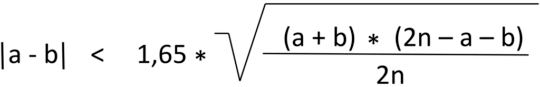
In which:
- a is the total frequency of the category most often given (the mode)
- b is the total frequency of the category in second place and
- n is the total sum of responses or number of respondents, being analysed.
As you can see from the inequation, the result of the Fong test depends most heavily on the difference between a feature being assigned to one category, or the next most frequent.
The following example shows feature 1 being classified as an excitement attribute is statistically significant. By contrast, feature 2 being classified a performance attribute is not statistically significant.

Conclusion: Use the Kano model to understand customer expectations and strategically address these
The Kano model helps you better understand your customers‘ expectations, and the impact of these on customer satisfaction. These insights help you set market-driven priorities in your product development strategy and to avoid spending time on unnecessary development. This of course saves time and money, and conserves in-house resources. Use the Kano model to enable you to concentrate on the things which have the highest effect on customer and user satisfaction, which will secure the success of your company long-term.
[1] A modified version of that by: Berger, C., Blauth, R., Boger, D., Bolster, C., Burchill, G., DuMouchel, W., Pouliot, F., Richter, R., Rubinoff, A., Shen, D., Timko, M., & Walden, D. (1993). Kano’s Methods for Understanding Customer-defined Quality. Center for Quality of Management Journal, 2(4), S. 3-35
[2] https://foldingburritos.com/kano-model/
[3] Fong, D. (1996). Using the self-stated importance questionnaire to interpret Kano questionnaire results.The Center for Quality Management Journal, 5, 21 – 24.
Thank you for your message
We appreciate your interest in SEEBURGER
Get in contact with us:
Please enter details about your project in the message section so we can direct your inquiry to the right consultant.


Written by: Rolf Holicki
Rolf Holicki, Director BU E-Invoicing, SAP&Web Process, is responsible for the SAP/WEB applications and digitization expert. He has more than 25 years of experience in e-invoicing, SAP, Workflow and business process automation. Rolf Holicki has been with SEEBURGER since 2005.